In this tutorial we cover the following topics
- Concepts, info etc.
- First iOS application
- Step 1: setting up a project in Xcode
- Step 2: a closer look at the project files
- Step 3: designing the user interface (add first button)
- Step 4: designing the user interface (add second button)
- Step 5: add the label and outlet
- Step 6: add an action method
- Step 7: fix the layout
- Step 8: run
- Step 9: fix the layout, continued
- Step 10: run
Cocoa Touch - a UI framework for building software programs to run on iOS (for the iPhone, iPod Touch, and iPad) - heavily uses model-view-controller (MVC) pattern. MVC divides a given software application into three interconnected parts, so as to separate internal representations of information from the ways that information is presented to or accepted from the user.
- The model directly manages the application's data.
- The view can be any output representation of information, such as a chart or a diagram. Also other elements like windows, controls, and other that the user can see and interact with are considered to be a part of a view. Multiple views of the same information are possible, such as a bar chart for management and a tabular view for accountants.
- The controller, accepts input and converts it to commands for the model or view. Controller binds together the model and view. It contains the application logic that decides how to handle the user’s inputs.
In addition to dividing the application into three kinds of components, the model-view-controller design defines the interactions between them.
- A model stores data that is retrieved according to commands from the controller and displayed in the view.
- A view generates an output presentation to the user based on changes in the model.
- A controller can send commands to the model to update the model's state (e.g. editing a document). It can also send commands to its associated view to change the view's presentation of the model (e.g. by scrolling through a document).
It is worth to note that MVC pattern was introduced into Smalltalk - the precedesor of Objective-C.
An interface objects in a storyboard or nib file can be set up to trigger special methods in our controller class: action methods. For example, we can decide that when the user press a button, a specific action method should be called. Actions are methods that are declared with a special return
IBAction code. The declaration for an action method will take one of the following forms:
|
1 2 3 |
@IBAction func doSomething() @IBAction func doSomething(_ sender: UIButton) @IBAction func doSomething(_ sender: UIButton, forEvent event: UIEvent) |
A controller class can refer to objects in a storyboard or nib file by using a special kind of property called an outlet. We can think of an outlet as a pointer to an object within the user interface. For example we can create a button in Interface Builder. By declaring an outlet and connecting that outlet to the button object, we would then be able to use the outlet from within a code to change the text displayed on that button.
Outlets are special class properties that are declared using the keyword IBOutlet. Below there is an example of an outlet called myButton, which can be set to point to any button in the user interface.
|
1 |
@IBOutlet weak var labelInfo: UILabel! |
Interface Builder - an Xcode part we use to design iOS application - supports a few different file types.
.nibThe oldes one is a binary fomat that uses the extension.nib
Each nib file can contain any number of objects, but when working on iOS projects, each one will usually contain a single view and controllers or other objects that it is connected to. Such a approach help us to divide an aplication into idependent parts which can be loaded ony when they are needed for display..xibThis is a modern, XML-based, version of.nibfiles. Both of these formats contain exactly the same sort of document, but the.xibas text-based is more natual choice in term of human readability and source control management systems..storyboardThis type of file can contain several view controllers, as well as information about how they are connected to each other when the application runs. A storyboard never loads all its contents at once which is opposite to the all at once load nib files.- It's good to note that although
.nibfiles are today not in use - they are replaced by modern formats - Interface Builder files are still called nib files in many documentation, regardless of whether the extension actually used for the file is.xibor.nib.
- Apple provides the iOS Human Interface Guidelines (referred also as HIG) to tell how you should, and shouldn’t, design a user interface for iOS devices. You’ll find it at http://developer.apple.com/library/ios/documentation/ UserExperience/Conceptual/MobileHIG/ Especially Icon and Image Sizes is worth to read.
- The Ultimate Guide To iPhone Resolutions
- iOS Human Interface Guidelines
- App Programming Guide for iOS
- Step 1: setting up a project in Xcode
- Step 2: a closer look at the project files
- Step 3: designing the user interface (add first button)
- Step 4: designing the user interface (add second button)
- Step 5: add the label and outlet
- Step 6: add an action method
- Step 7: fix the layout
- Step 8: run
- Step 9: fix the layout, continued
- Step 10: run
- Step 1: setting up a project in Xcode
Launch Xcode and select File | New | Project... In project window select iOS | Application | Single View Application template and then click the Next button.

You will see the project options sheet, which should look like below (image below shows the completed options sheet after specifying the fields). You can leave both Include Unit Test and Include UI Test fields untouched because we will not use any test, or check them to see files and folders releted with them.

Press Next button, and you will be prompted for a location for your project.

Press Create to save the project. - Step 2: a closer look at the project files
Let’s look at the files that were created for us by Xcode.

- The first folder, which is always named after our project, is
Swift iOS First Application. This is a place where most of the code that we will create go. In the Project Navigator expand theiOS First Applicationfolder. This folder should contains- Two source code files (
AppDelegate.swifandViewController.swift). The controller class calledViewControlleris responsible for managing our application’s view. - A storyboard file containing the user interface elements specific to our project’s main view controller (
Main.storyboard). - A launch screen file (
LaunchScreen.storyboard). - An asset catalog for containing any images that the application needs (
Assets.xcassets). - An information property list file that contains essential configuration information for a bundled executable (
Info.plist).
- Two source code files (
- The
Swift iOS First Application(UI)Testfolders contains the initial files needed to write some unit tests for the application. - The
Productsfolder contains the application that this project produces when it is built.
It is worth to note that before Xcode 9 the folders in the navigator area didn't have to correspond to real folders in a file system. These were logical groupings within Xcode to help us to mantain the source code. The hierarchy inside Xcode was completely independent of the file system hierarchy, so moving a file in Xcode wasn't changed the file’s location on the file system.
In Xcode 9, moving a file from one Xcode group to another Xcode group will also physically move it to that folder as well.
When we take a closer look at
ViewController.swiftfile we can find there a boilerplate code in the form ofviewDidLoadanddidReceiveMemoryWarningmethods. We can keep them all or delete (or simply comment) if we have no intention to use them. - The first folder, which is always named after our project, is
- Step 3: designing the user interface (add first button)
Single clickMain.storyboardfile to open the application’s view in Xcode’s Interface Builder.

Now we are going to add some simple components: two buttons and one label. Select View | Libraries | Show Library or pres Shift + Command + L (previous versions of Xcode the correct option was View | Utilities | Object Library or there was a button designated to show Object Library) and find in Object Library Button object (you can complete this faster with a help of serach field).

Drag the Button from the library and drop it on the white window inside the editing area. This will add a button to your application’s view. Place the button along the left side of the view the appropriate distance from the left edge by using the blue guidelines that appear to place it. For vertical placement, use the blue guidelines to place the button halfway down in the view.


Double-click this button - this will allow you to edit the button’s title. Give this button a title Previous.

Select View | Assistant Editor | Show Assistant Editor to open the Assistant Editor.

Alternatively we can show and hide the Assistant Editor by clicking the middle editor button in the collection of buttons on the upper-right side of the project window.

You should seeViewController.swiftfile. If, for some reason, it is not displaying the file that we want to see, we can use the jump bar (depicted as to overlapping rings) at the top of the Assistant Editor to fix that.To add action method to the view controller’s class click the button that was added to the storyboard, hold down the Control key, and then drag from the button over to the source code in the Assistant Editor (we should see a blue line). Move the cursor so it’s in the class and when you will see a gray pop-up you can release the mouse button.

Now we have to fill a floating pop-up.


Press Connect button or simply press Enter key to finish this process which should result the action method code insertion.

- Step 4: designing the user interface (add second button)
If you have not to much space on the screen, you can hide unused panels:Dcument Outline

theNavigator

and theUtilities.


In the first half this step is very similar to the previous step: add second button named Next, located on the right.


The reason why separated this step from the previous is that this time, we don’t want to create a new action method. Instead, we want to connect this button to the existing one that Xcode created a moment ago. We do it the very similar way as we did for the first button.Control-click the button and drag toward the code in the Assistant Editor (remember to open it before). Drag toward the declaration of the reviousl created
buttonPress(_ sender: UIButton)method. This time, as the cursor gets near method source code, that method should highlight, and we will see a gray pop-up Connect Action. Release the mouse button. Xcode will connect the button to the action method. That will cause the button, when tapped, to trigger the same action method as the previous button.

You can verify that the trigger was creaded by pressing right mouse button on the button where in Sent Events section you shoud be able to find Touch Up Inside - View Controller buttonPress

- Step 5: add the label and outlet
Now you can use what you have learned and add a label object as we did it for buttons.


Select View | Utilities | Show Attributes Inspector or pressing the Attributes inspector icon

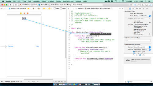
we can change some of the label's properties. Feel free to make some experiments.To add an outlet for this label, select the label in Interface Builder and Control-drag from the label to the source file (as we did it before). After releasing mouse button we will see a pop-up window that offers to create an Outlet or an Outlet Collection.


As for buttons we can verify if outles has been created.

We can do this also by hover over gray dot in source code editor

or by selecting theConnections inspector


- Step 6: add an action method
Add the following code to thebuttonPressmethod:
12345@IBAction func buttonPress(_ sender: UIButton) {let title = sender.title(for: UIControlState.normal)let textForLabel = "\(title ?? "?") button pressed"labelInfo.text = textForLabel}
Select Product | Run

The Previous button is accessible and works correctly but where is Next button? And why label is so tight that we can see just a few letters from our string? To fix this we have to work a little bit with a layout. - Step 7: fix the layout
To arrange correctly our components we will use Auto Layout. The idea behind Auto Layout is that we use some constraints to specify how we want the controls to be placed. Let's say that we want- The Previous button to be vertically centered and close to the left margin.
- The Next button to be vertically centered and close to the right margin.
- The label should be close to the left margin, some way down from the top of the screen.
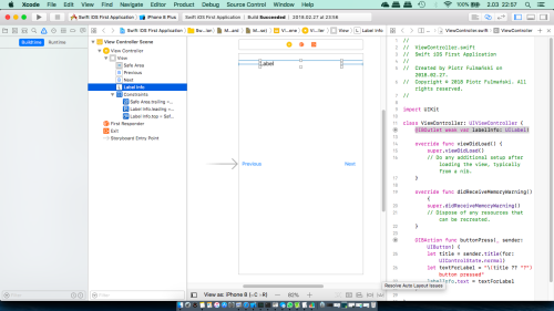
We’ll start fixing with positioning the label. Select
Main.storyboardin the Project Navigator and open the Document Outline to see the view hierarchy. Find the icon labeledViewand click on it to open the View icon (if it’s not already open). Hold down the Control key and drag the mouse from the label to its parent view. This is how we set an Auto Layout constraint between components (simply by dragging from one view to another).

Release the mouse and a gray pop-up with various options (each is a single constraint) will appear.

Clicking any of them will apply that constraint. To apply more than one constraint at a time, we need to hold down the Shift key while selecting them. In our case select only Top Space to Safe Area. To actually apply the constraints, click the mouse anywhere outside the pop-up. When you do this, the constraints that you have created appear under the heading Constraints in the Document Outline and are also represented visually in the storyboard.

Unfortunately we can see red arrow in Document Outline and after selecting it, details are displayed

Around the element we have problems with Auto Layout a red otline is also drawn - in this case it's hard to see it. There are three typical problems that Interface Builder highlights in this way:- We don’t have enough constraints to fully specify a view’s position or size.
- The view has constraints that are ambiguous.
- The constraints are correct, but the position and/or size of the view at runtime will not be the same as it is in Interface Builder.
.
Every time we can find out information about the problem also by clicking the yellow warning triangle in the Activity View to see an explanation in the Issue Navigator.

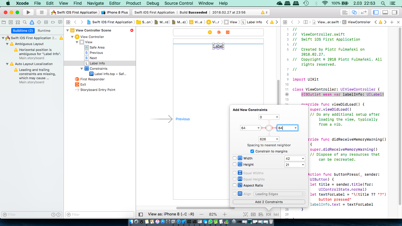
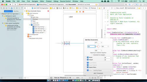
In our case this is Horizontal position is ambiguous for "Label Info" as well as there are problems with leading and trailing constraints.Select the label on the storyboard and click the Pin button at the bottom right of the storyboard editor to open Pin pop-up.


At the top of the pop-up, we will find four input fields connected to a small square by orange dashed lines. Set the constraint by entering 64 into left and right field.
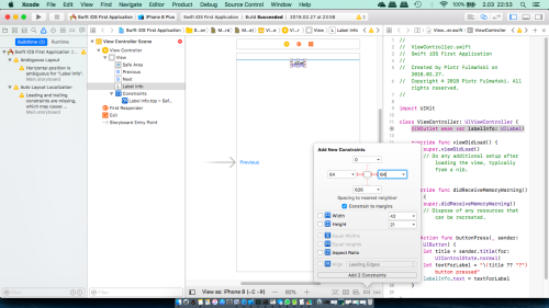
Press Add 2 Constraints or if it is inactive you can press Enter to apply the constraint to the button.
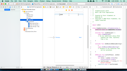
We have now applied all of the constraints that we need, but sometimes there may still be warnings in the Activity View. To fix that, use the Resolve Auto Layout Issues button.
Click the button to open its pop-up and then click Update Frames from the top group of options. We use the option from the top group because we want only the frame of the label views in the view controller to be adjusted.
At this point, label label should be done so let's fix the buttons' positions.Select the Previous button on the storyboard and click the Align button at the bottom right of the storyboard editor.

We want the button to be vertically centered, so select Vertically in Container in the pop-up and then click Add 1 Constraint.


Now we have to add left margin constraint as we did it for the label.


If the value we have just entered is bad we can correct it selecting constraint in the storyboard or the Document Outline and open the Attributes Inspector.

Great, the Previous button is done so let's fix the Next.Select the Next button and repet steps we did for Previous button (but remember to set right not left margin constraint.

- Step 8: run
Now we can again select Product | Run

The result maybe is not perfect but much better than last time. - Step 9: fix the layout, continued
Because there are still 2 layout problems, leading and trailing constraints are missing, we have to fix them.
Select the Next button on the storyboard

Hold down the Control key and drag the mouse from the Next button to the Previous button.

Release the mouse and a gray pop-up with constraints will appear.

Select Horizontal Spacing.

In the Document Outline select the constraint you have just add

In the Attributes Inspector, as Relation select Less Than or Equal

As you can see, all problems are gone. - Step 10: run
Now we can again select Product | Run


That's it.