
In this tutorial we cover the following topics
- Text fields
- Excercise 1
- Sliders
- Excercise 2
- Segmented controls
- Excercise 3
- Switches
- Excercise 4
- Image view
- Excercise 5
- Action sheets and alerts
- Icons
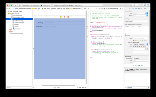
- Step 1: add text field and label
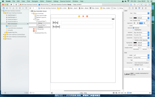
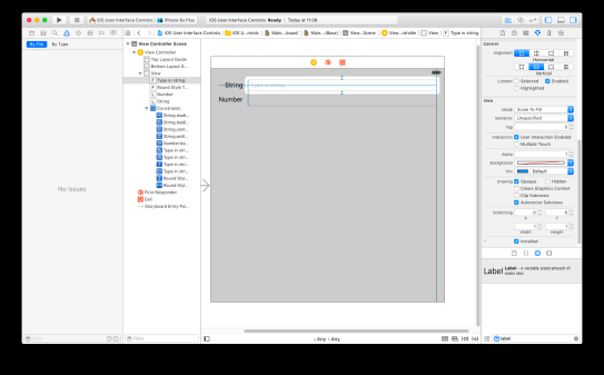
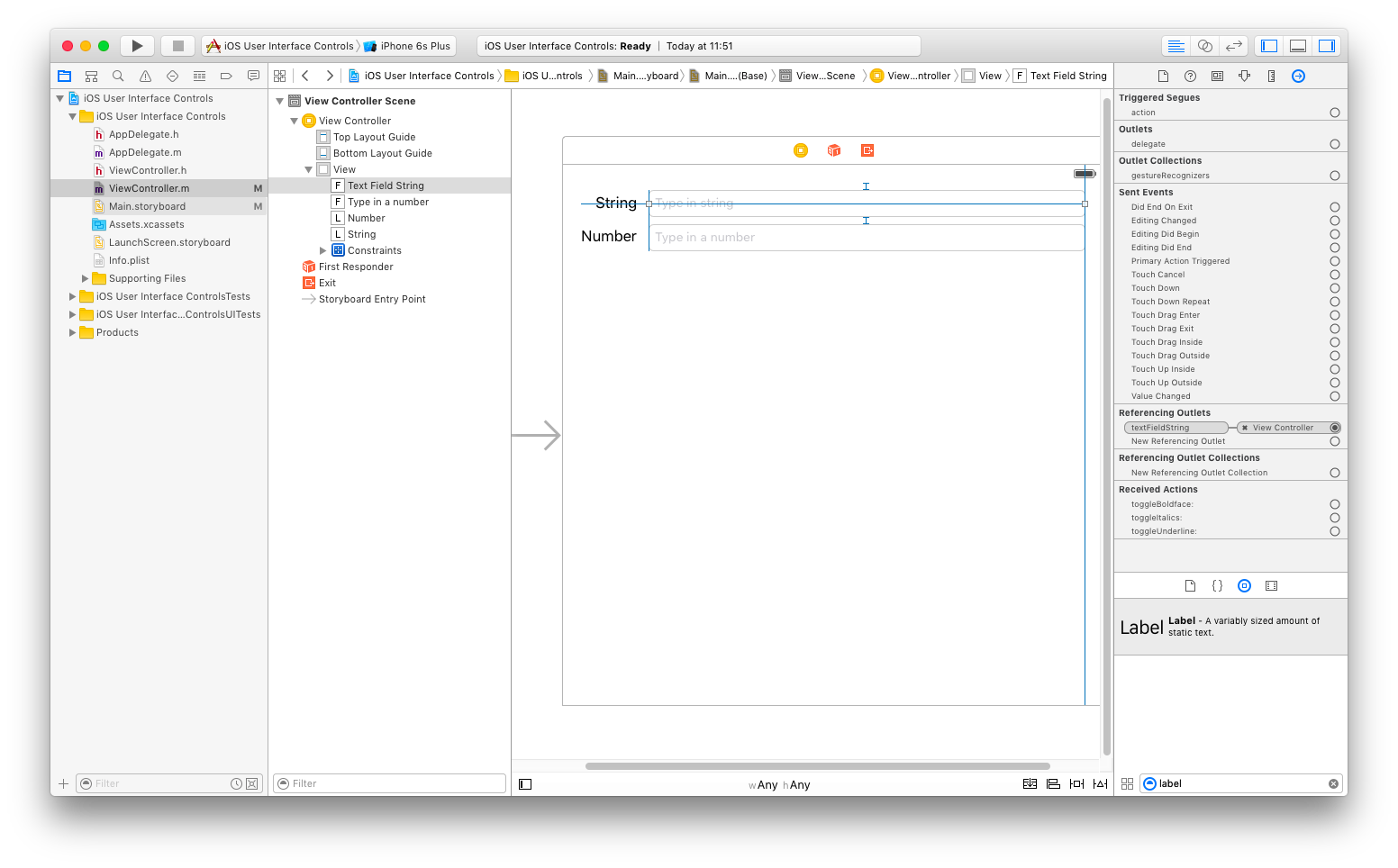
Grab a text field from the Object Library, drag it into the View and align it with the right margin. Next grab a label from the library, and then drag that over so it is aligned with the left margin of the view and vertically with the text field you just placed.Double-click the label you just dropped, change it to read String instead of Label and press the Enter key to commit your changes.

- Step 2: add second text field and label
Repeat previous step and add text field with a label Number.
- Step 3: resize text fields and labels
Expand the size of the bottom text field to the left, so it is snug up against the right side of the label. Because the bottom label is longer, we start with it to have both text fields the same size. Now, expand the top text field in the same way, so that it matches the bottom one in size.
Now let's right-aligne labels.
- Click the top label, hold down the Shift key, and click the second label to select both.
- If the Attributes Inspector is not visible, press Option+Command+4 to bring it up, make sure the Label section is expanded.
- Use the Alignment control in the inspector to make the content of these labels right-justified.
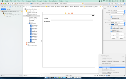
- Make a constraint to make sure these two fields are always the same width by selecting at the bottom of the screen Pin | Widths Equally.
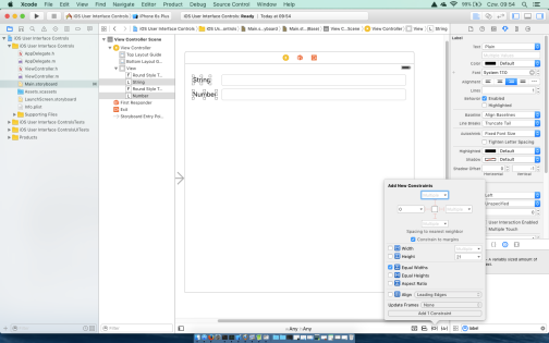
- Make sure that string width is equal to number width; if not reverse items

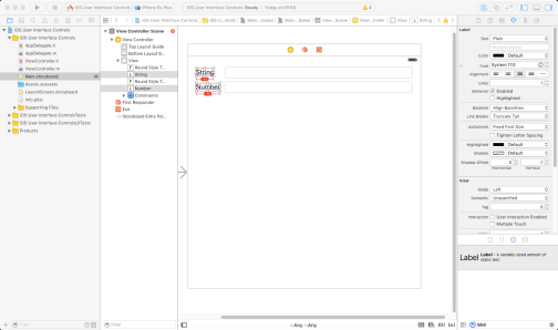
- If there are still some layout problems

you can fix tem on your own or use Resolve Auto Layout Issues | Add Missing Constraints

and next Resolve Auto Layout Issues | Update Frames.
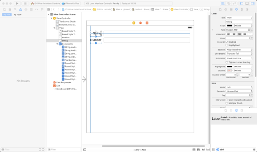
- Step 4: inspecting text field attributes
Spend a few minutes inspecting text field attributes in the Attributes inspector (Option+Command+4). Working with it- Type in the text Type in a string as the placeholder for string text field.

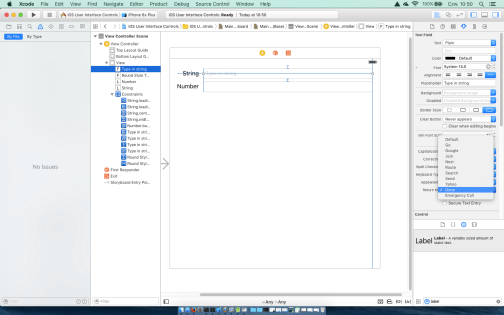
- Change default value in the Return Key pop-up. The Return key is the key on the lower right of the virtual keyboard, and its label changes based on what we’re doing: it coud be Search for web browser, Next for a form or Done for independent fields. To keep it different from default, let's change it to Done.
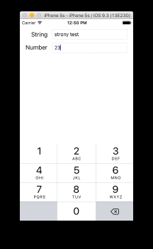
- Type in the text Type in a number as the placeholder for number text field.
-
From the Keyboard pop-up menu select Number Pad (since we want the user to enter only numbers, not letters).
-
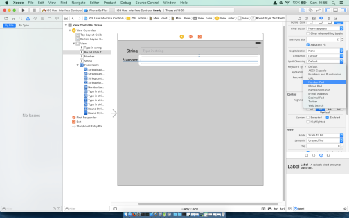
For both text fields check the Opaque check box and uncheck Clears Graphics Context and Clip Subviews.
By selecting Opaque, we inform the system that nothing behind a view ever needs to be drawn, so it does not need to waste processing time.
When Clears Graphics Context is checked the system will draw the entire area covered by the object in transparent black before it actually draws the object. Again, for performance reasons it should be turned off.
Clip Subviews is an interesting option. If your view contains subviews, and those subviews are not completely contained within the bounds of its parent view, this check box determines how the subviews will be drawn. If Clip Subviews is checked, only the portions of subviews that lie within the bounds of the parent will be drawn. If Clip Subviews is unchecked, subviews will be drawn completely, even if they lie outside the bounds of the parent. Again, for performance reasons it should be unchecked because calculating the clipping area and displaying only part of the subviews is a costly operation while in most cases a subview won’t lie outside the bounds of its superview so checking this field would result a CPU wast of time.
- Type in the text Type in a string as the placeholder for string text field.
- Step 5: add an outlets
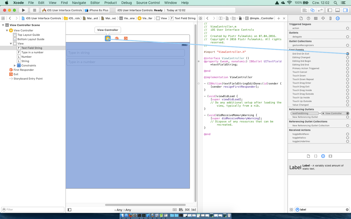
At this point we should be familiar with outetd because we did them in the previous part of this tutorial. Make sureViewController.mis showing in the Assistant Editor. As we did it before, Control-drag from the top text field in the view over to theViewController.mfile, right below the@interfaceline. We should see a gray pop-up that reads Insert Outlet, Action, or Outlet Collection.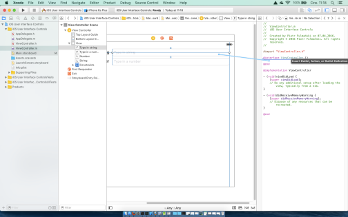
Release the mouse button, type
textFieldStringinto the Name field and then accpt by hit Return or click the Connect button.
Repeate the same process for the second text field, creating and connecting it to a property called
textFieldNumber. - Step 6: closing the keyboard for string field
When the user taps the Done button on the keyboard, a Did End On Exit event will be generated. This is a right time to tell the text field to give up control so that the keyboard will go away.To bind some event with an action, we can proceed as for the Previous button in previous part of this tutorial (see Step 3: designing the user interface (add first button) at First application). On the other hand, this is a good chance to show other method so let's do it.
Add the following action method at the bottom of ViewController.m
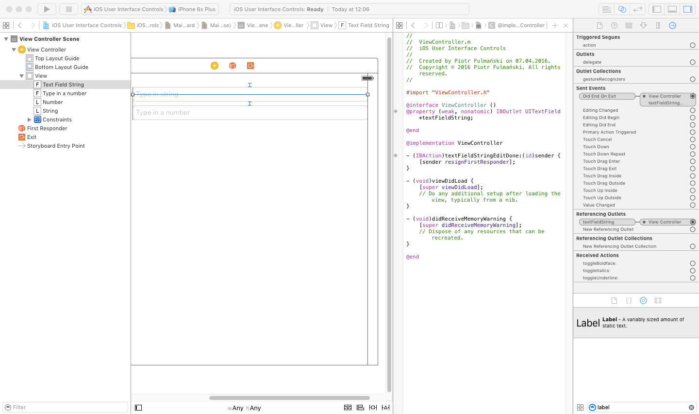
123- (IBAction)textFieldStringEditDone:(UITextField *)sender {[sender resignFirstResponder];}The first responder is the control with which the user is currently interacting. In the above method we tell our control to resign as a first responder so to the previous control the user worked with will take this role. When a text field yields first responder status, the keyboard associated with it goes away.
Select
Main.storyboardin the Project Navigator, single-click the top text field, and press Option+Command+6 to bring up the connections inspector.
Press Control button and drag from the circle next to Did End On Exit to the yellow View Controller icon in the storyboard, in the bar that’s just above the view you’ve been configuring, and let go.

A small pop-up menu will appear containing the name of a single action, the one we just added. Click the
textFieldStringEditDone:action to select it.
You can also do this by dragging to the
textFieldStringEditDone:method in the assistant view.
Repeat this procedure with the second text field.
- Step 7: closing the keyboard for number field
Unfortunately not all keyboard layouts feature a Return button. To solve this problem we will implement most natural approach: if the user tap anywhere in the view where there’s no active control the keyboard will go away.Add the following action method at the bottom of
ViewController.m1234- (IBAction)tapOnBackground:(id)sender {[self.textFieldString resignFirstResponder];[self.textFieldNumber resignFirstResponder];}Next we should change the underlying class of the
viewproperty inherited by our view controller fromUIViewController. Now this property points to an instance of UIView that acts as a container for all the items in our user interface. If we change the class of the object that view points to and set it as UIControl, the view will behave like controls object (for example button). It is safe to do this, because UIControl is a subclass of UIView.Press Option+Command+3 to bring up the Identity Inspector.
and change the class to UIControl. Next press Option+Command+6 to bring up the Connections Inspector. As we did it for text fields, drag from the Touch Down event to the View Controller icon, and choose the
tapOnBackground:action.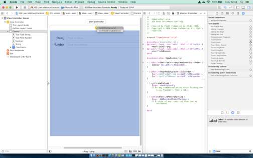
- Step 7: run the application
Select Product | Run and verify if everything is as expected.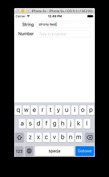
In my case there were problems with virtual numerical keyboard. If the keyboard doesn’t show up on the simulator, try selecting Hardware | Keyboard | Toggle Software Keyboard. This should resolve this problem


Write an iOS application according to the following rules
- Assumptions
- This application is an extension of an application from First application: Excercise 1.
- Application should allow to append data to a runing data file. Again you have to use an auxiliary class to mimic the file operaton.
- Add three text fields in the application:
- for a date (enter date as text in the YYYY-MM-DD format);
- for a distance;
- for a time (in seconds).
- Add button Append.
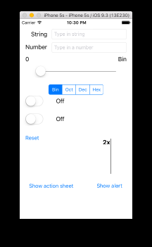
- Step 1: add slider and label
The idea is as follow: slider changes it's value from 0 to 255. Every value selected by slider is then transformed to binary 8-bit representation and displayed with the label's help.Select a slider from the Object Library and put it in our view. Press Option+Command+4 to bring up the Attributes Inspector. Use the inspector to set the Minimum value to 0, the Maximum value to 255, and the Current value to 0. Set the Events Continuous Update check box if not checked.
Next select a label and place it next to the slider. Change the label's text to 00000000. This is the largest value that the slider can hold, and we can use that to determine the correct width of the slider.
- Step 2: add any necessary constraints
Pleas fell free to reposition your items indisde view and add / change / remove any constraints you want.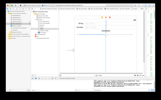
- Step 3: add outlets and actions
Add toViewController.m- an outlet
labelForSlider; - an outlet
slider; - an action
sliderChange.
- an outlet
- Step 4: ensure correct initial values for slider and corresponding label
Change inViewController.m
123456- (void)viewDidLoad {[super viewDidLoad];// Do any additional setup after loading the view, typically from a nib.self.labelForSlider.text = @"00000000";self.slider.value = 0;} - Step 5: modify action method
Modify inViewController.m
1234- (IBAction)sliderChange:(UISlider *)sender {int decimalValue = (int)lroundf(sender.value);self.labelForSlider.text = [self decimalToBinaryAsString: decimalValue];}Function
decimalToBinaryAsStringshoud transform integer from interval [0,255] to binary 8-bit number and return it as string. Implementation of this method is left as an excercise. For now we can use dummy implementation as below123- (NSString *)decimalToBinaryAsString:(int)decimalValue{return [NSString stringWithFormat:@"%d", decimalValue];} - Step 6: run the application

Write an iOS application according to the following rules
- Assumptions
- This application is an extension of an application from Excercise 1.
- Add slider to the application.
- With the slider you should be able to quickly switch between running results.
- Step 1: add segmented control and label
Drag a Segmented Control and Labelfrom the Object Library and place it on the view.

- Step 2: change segmented control and label properties
Press Option+Command+4 to open the Attributes Inspector and change Segments property to 4.Double-click the word First on the segmented control and change the title from First to Binary. After doing that, repeat the process with the Second segment, renaming it Octal, rename third as Decimal and las one as Hexadecimal. Fnally drag the control back into its centered position. If you, like me, jave some problems with double-clicking an Attributes Inspector would be helpful with properties Segment (where you can choose the segment you want to edit) and Title.
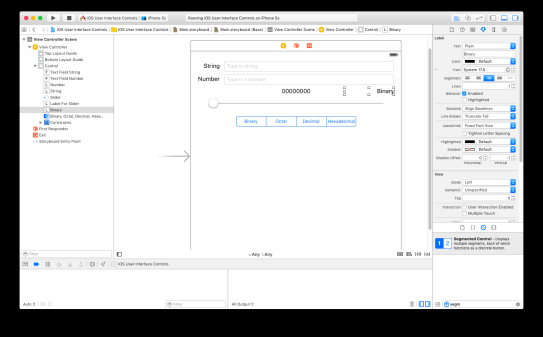
Double-click the label and change its title to Binary. - Step 3: add any necessary constraints
Pleas fell free to reposition your items indisde view and add / change / remove any constraints you want. - Step 4: add an outlet and an action
Control-drag from the newly added label somewhere to the@interfacesection inViewController.mand create a property caledlabelNumeralSystem.With the same method add an outlet for segmented control named
segmentedControl.Control-drag from the segmented control to the Assistant Editor, right above the
@enddeclaration. Insert this way a new action method calledsegmentedControlChangesand set the Type of its sender parameter to UISegmentedControl. - Step 5: make some code changes
Add the following code tosegmentedControlChangesfunction123- (IBAction)segmentedControlChanges:(UISegmentedControl *)sender {self.labelNumeralSystem.text = [sender titleForSegmentAtIndex:sender.selectedSegmentIndex];}Modify and add code to
viewDidLoadfunction1234567- (void)viewDidLoad {[super viewDidLoad];self.slider.value = 0;self.labelForSlider.text = [self decimalToBinaryAsString: self.slider.value];[self.segmentedControl setSelectedSegmentIndex:0];self.labelNumeralSystem.text = [self.segmentedControl titleForSegmentAtIndex:self.segmentedControl.selectedSegmentIndex];} - Step 6: run the application
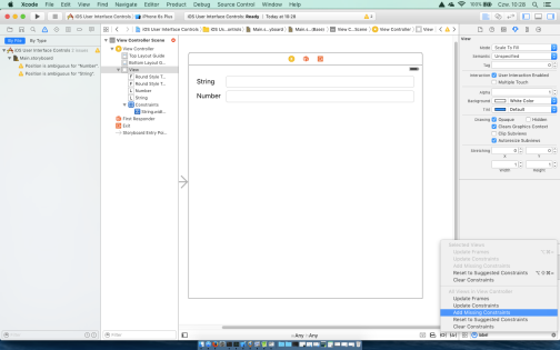
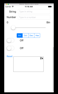
Now you can run your application If there are some layout problems like on the image below

you can (or have to) fix it. - Step 7: fix all layout problems and test an application


Write an iOS application according to the following rules
- Assumptions
- This application is an extension of an application from Excercise 2.
- Add segmented control to the application.
- With this segmented control you can change type of training, for example: running or cycling.
- Step 1: add switches, labels and button
Grab two switches from the library and place it on the view. Next add two labels and one button.
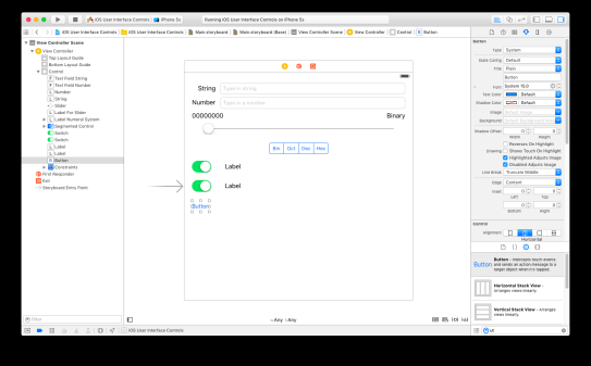
- Step 2: change items properties
Change the button text to Reset. - Step 3: add any necessary constraints
If you want to do it fast, you can try to use Add Missing Constraints from Editor | Resolve Auto Layouts Issues menu. Results are more or less correct and can help to find best set of your own constraints. - Step 4: add an outlet and an action
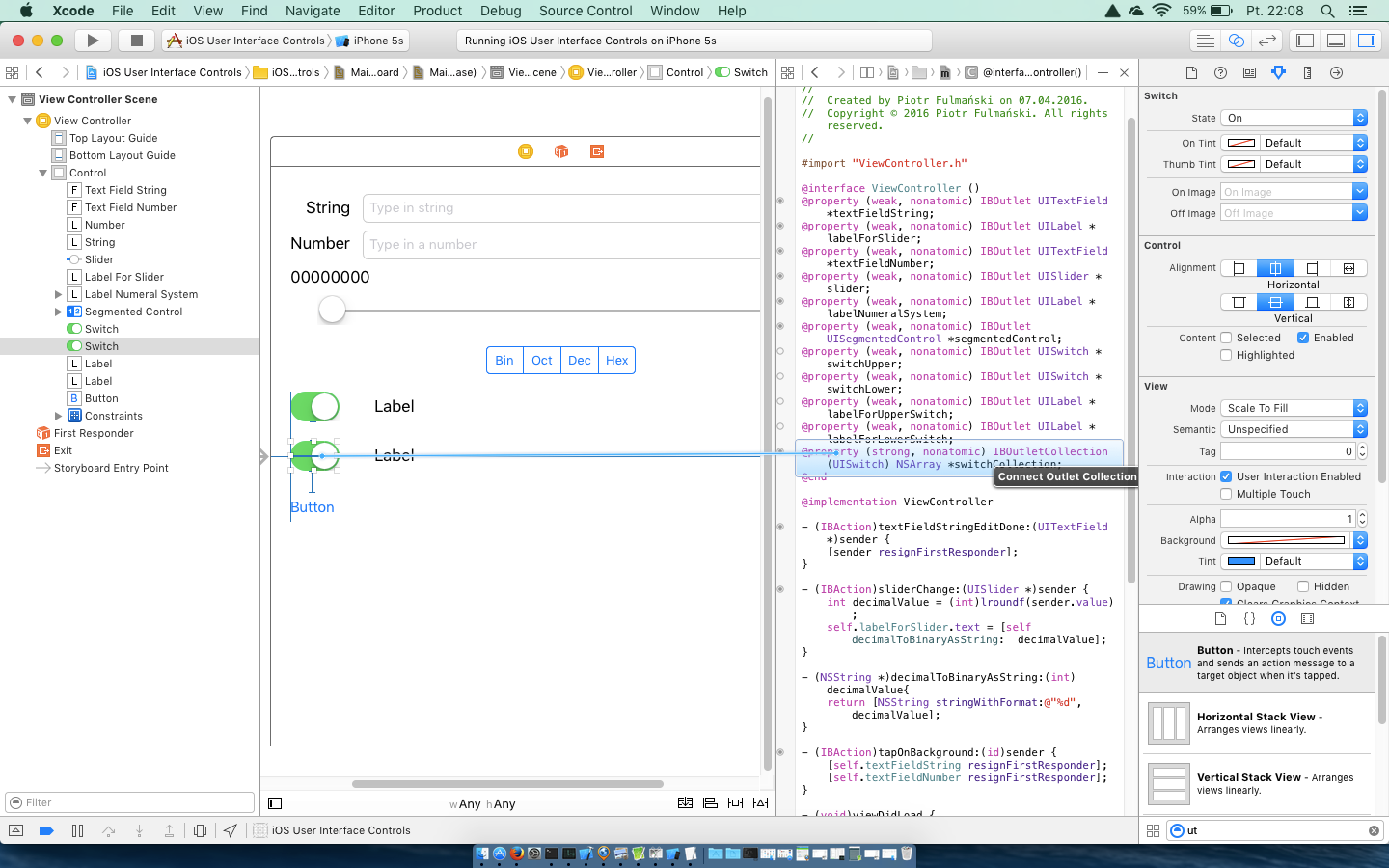
Create- property (outlet)
labelForUpperSwitchrelated to label next to upper switch, - property (outlet)
labelForLowerSwitchrelated to label next to lower switch, - property (outlet collection)
switchCollectionrelated to both upper and lower switch, - property (outlet collection)
labelForSwitchCollectionrelated to both upper and lower label.
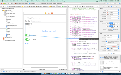
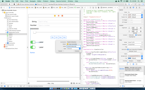
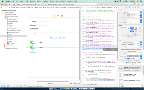
- property (outlet)
switchUpperChangerelated to upper switch,switchLowerChangerelated to lower switch,buttonSwitchResetPressrelated to reset button.- Step 5: make some code changes
Modify and add code toViewController.m
123456789101112131415161718192021222324- (IBAction)switchUpperChange:(UISwitch *)sender {[self changeLabel:self.labelForUpperSwitch forSwitch:sender];}- (IBAction)switchLowerChange:(UISwitch *)sender {[self changeLabel:self.labelForLowerSwitch forSwitch:sender];}- (IBAction)buttonSwitchResetPress:(UIButton *)sender {[self switchResetToDefaut];}- (void)switchResetToDefaut{for (UISwitch *switchUI in self.switchCollection) {[switchUI setOn: NO animated:YES];}for (UILabel *label in self.labelForSwitchCollection){label.text = @"Off";}}- (void)changeLabel:(UILabel *) label forSwitch:(UISwitch *) switchUI{label.text = switchUI.isOn?@"On":@"Off";}
12345678- (void)viewDidLoad {[super viewDidLoad];self.slider.value = 0;self.labelForSlider.text = [self decimalToBinaryAsString: self.slider.value];[self.segmentedControl setSelectedSegmentIndex:0];self.labelNumeralSystem.text = [self.segmentedControl titleForSegmentAtIndex:self.segmentedControl.selectedSegmentIndex];[self switchResetToDefaut];} - Step 6: run the application


Create action

Write an iOS application according to the following rules
- Assumptions
- This application is an extension of an application from Excercise 3.
- Add switches to the application.
- With these switches you can check some other training information, for example: sunny weather, windy or cold.
- Step 1: import images into Xcode.
Let’s first import the image we’ll use in our image view - the image must be imported into Xcode before it will be available for use inside Interface Builder. Because of differences in screen dimension (see section for more details) we have to prepare three versions of our image- a standard version saved as
image_frame.png(200 pixels width and 100 height in my case), - Retina version I
image_frame@2x.png(400 pixels width and 200 height in my case) - Retina version II
image_frame@3x.png(600 pixels width and 300 height in my case)
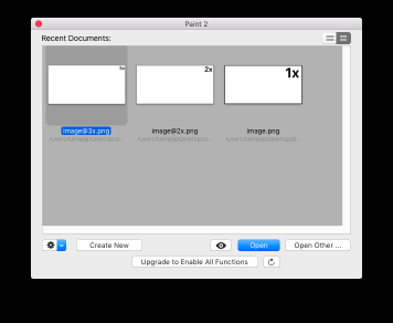
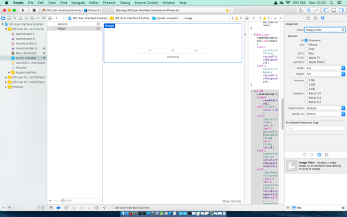
It is a goog idea to prepare three version add let the application decide which of them to use at runtime instead of prepare one version and force the application to resize it.In Xcode, select Assets.xcassets in the Project Navigator
and click right mouse button below AppIcon

or select from top main menu Editor | Add Assets | New Image Set

This creates a new spot for adding your actual image files.

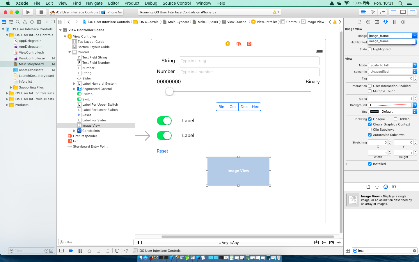
Now it’s just called Image; in the Attributes Inspector we can change the image name to image_frame
Now add the images themselves to the image_frame image set by dragging each image from the Finder to the image detail box.
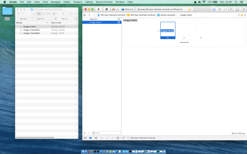
Drag image_frame.png to the spot labeled 1x, image_frame@2x.png to the 2x slot, and image_frame@3x.png to the 3x slot.

- a standard version saved as
- Step 2: add image view
From the Object Library drag an image view onto the view in the storyboard editor.
Use the drag handles to resize the image view to the approximate size of the image previously imported into Xcode. - Step 3: change image view properties
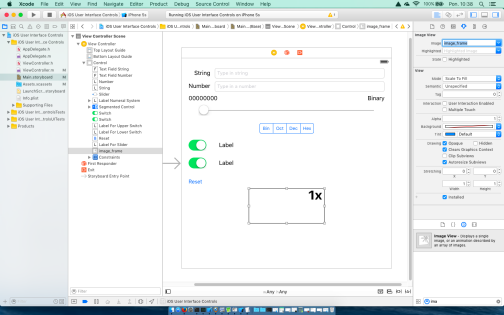
The most important setting for our image view is the topmost item in the inspector, labeled Image. Click the little arrow to the right of the field Image in the Attributes Inspector to see a pop-up menu that lists the available images. This list includes any images we have in our project’s image assets catalog. Select the image_frame image we have added in previous step.
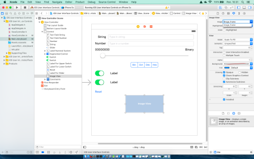
and it should appear in your image view.
In case of any problems like below
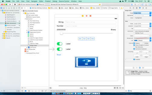
confirm your choice with Enter or press the pointer outside the pop-up.Notice that the image we used was scaled to completely fill the image view. The reason for this is that in the Attributes Inspector in View section, Mode setting is set to Scale To Fill. Let’s keep this setting and resize our image view to the exact size of our image.
Select the image view and press Command+= or select Editor | Size to Fit Content. This will resize the image view to match the size of its contents.
As we did it previosly, check the Opaque check box and uncheck Clears Graphics Context and Clip Subviews.
To make an image an interactive element, you can check User Interaction Enabled check box. In this example we don't need this, se we can uncheck this option.
- Step 4: add any necessary constraints
Simply add any necessary constraints as we did it many times before. - Step 5: add an outlet and an action
No outlets and actions this time. - Step 6: make some code changes
No code this time. - Step 7: run the application


Write an iOS application according to the following rules
- Assumptions
- This application is an extension of an application from Excercise 4.
- Add Image view to the application.
- Every time segmented control changes its state the image should correspond to selected type of training.
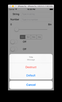
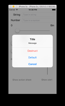
Action sheets and alerts are both used to provide the user with feedback
- Action sheets are used to force the user to make a choice between two or more items. Users are unable to continue using the application until they have tapped one of the buttons. The type of views or window which blocks user other actions is called a modal view or window. On iPhones, the action sheet comes up from the bottom of the screen while on the iPad, the position of the action sheet relative to another view (for example a button responsible for displaying this sheet) must be specified.
- Alerts appear as a rounded rectangle in the middle of the screen. Like action sheets, alerts force users to respond before they are allowed to continue using the application. Alerts are usually used to inform the user about something important. Alerts may be presented with only a single button, although there is an option of presenting multiple buttons if more than one response is appropriate.
- Step 1: add buttons we will use to fire our modals
- Step 1: add buttons
- Add button named
Show action sheet - Add button named
Show alert
- Add button named
- Step 2: change buttons properties
- Step 3: add any necessary constraints
- Step 4: add an actions
- Add an action
buttonActionSheetPressforShow action sheet - Add an action
buttonAlertPressforShow alert
- Add an action
- Step 1: add buttons
- Step 2: make some code changes
Modify and add code toViewController.m
1234567891011121314151617181920212223242526272829- (IBAction)buttonActionSheetPress:(UIButton *)sender {UIAlertController *controller =[UIAlertController alertControllerWithTitle:@"Title"message:@"Message"preferredStyle:UIAlertControllerStyleActionSheet];UIAlertAction *actionDestruct =[UIAlertAction actionWithTitle:@"Destruct"style:UIAlertActionStyleDestructivehandler:^(UIAlertAction *action){// Code to be executed when the button is pressed.}];UIAlertAction *actionCancel = [UIAlertAction actionWithTitle:@"Cancel"style:UIAlertActionStyleCancelhandler:nil];UIAlertAction *actionDefault = [UIAlertAction actionWithTitle:@"Default"style:UIAlertActionStyleDefaulthandler:nil];[controller addAction:actionDestruct];[controller addAction:actionCancel];[controller addAction:actionDefault];UIPopoverPresentationController *ppc =controller.popoverPresentationController;if (ppc != nil) {ppc.sourceView = sender;ppc.sourceRect = sender.bounds;}[self presentViewController:controller animated:YES completion:nil];}12345678910111213141516171819202122232425- (IBAction)buttonAlertPress:(UIButton *)sender {UIAlertController *controller =[UIAlertControlleralertControllerWithTitle:@"Title"message:@"Message"preferredStyle:UIAlertControllerStyleAlert];UIAlertAction *actionDestruct =[UIAlertAction actionWithTitle:@"Destruct"style:UIAlertActionStyleDestructivehandler:^(UIAlertAction *action){// Code to be executed when the button is pressed.}];UIAlertAction *actionCancel = [UIAlertAction actionWithTitle:@"Cancel"style:UIAlertActionStyleCancelhandler:nil];UIAlertAction *actionDefault = [UIAlertAction actionWithTitle:@"Default"style:UIAlertActionStyleDefaulthandler:nil];[controller addAction:actionDestruct];[controller addAction:actionCancel];[controller addAction:actionDefault];[self presentViewController:controller animated:YES completion:nil];} - Step 3: run the application


For icons, as for image, because of displays variety, we have to prepare few versions of our icon. In this case we need five versions for iPhone device and sevenś versions for IPad

|
- 180 x 180 pixel square (60 pt version in scale 3; iPhone App, iPhone Spotlight),
- 167 x 167 pixel square (83.5 pt version in scale 2; iPad Pro App),
- 152 x 152 pixel square (76 pt version in scale 2; iPad App),
- 120 x 120 pixel square (60 pt version in scale 2; iPhone App, 40 pt version in scale 3; iPhone Spotlight),
- 87 x 87 pixel square (29 pt version in scale 3; iPhone Settings),
- 80 x 80 pixel square (40 pt version in scale 2; iPhone Spotlight, iPad Spotlight),
- 76 x 76 pixel square (76 pt version in scale 1; iPad App),
- 58 x 58 pixel square (29 pt version in scale 2; iPhone Settings, iPad Settings),
- 40 x 40 pixel square (40 pt version in scale 1; iPad Spotlight).
- 29 x 29 pixel square (29 pt version in scale 1; iPad Settings).
Having correct png images, we have to drag them from the Finder to the correct item (area) in Xcode. This will copy those icons into our project.